Week 13
Emotions Chatbot
UI Lo-Fi Prototype
Continuing with the visuals made from the TouchDesigner visualiser integrated with GPT, I wanted to visualise what it might look like as an interface. I just know I do not want it to have the typical texting interface, where it is just plain text and solid colours. I would like it to have a bit more life and look more playful and engaging.
Paper Prototype
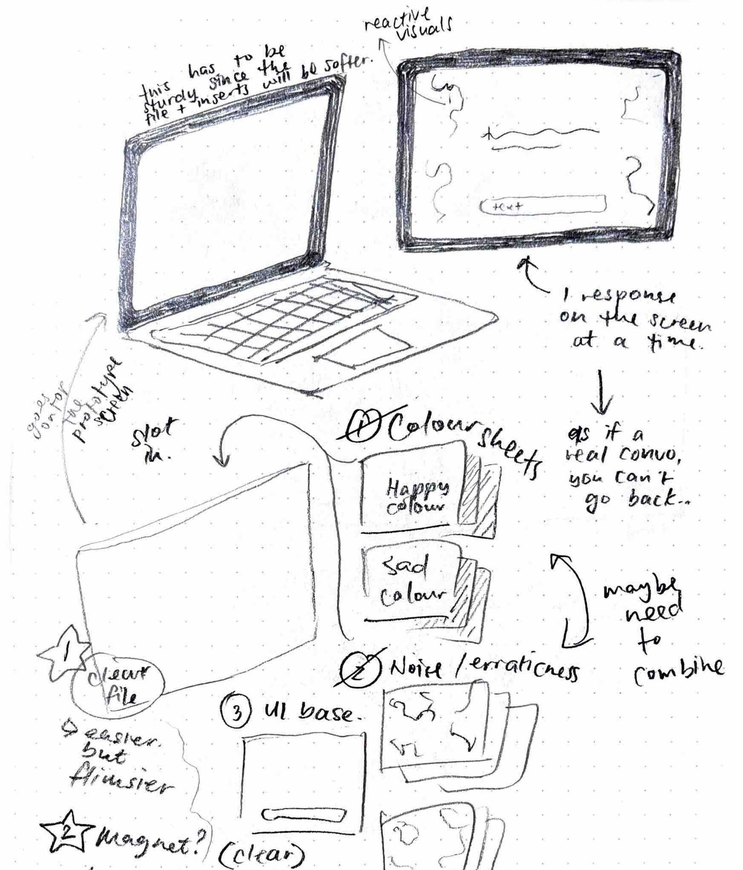
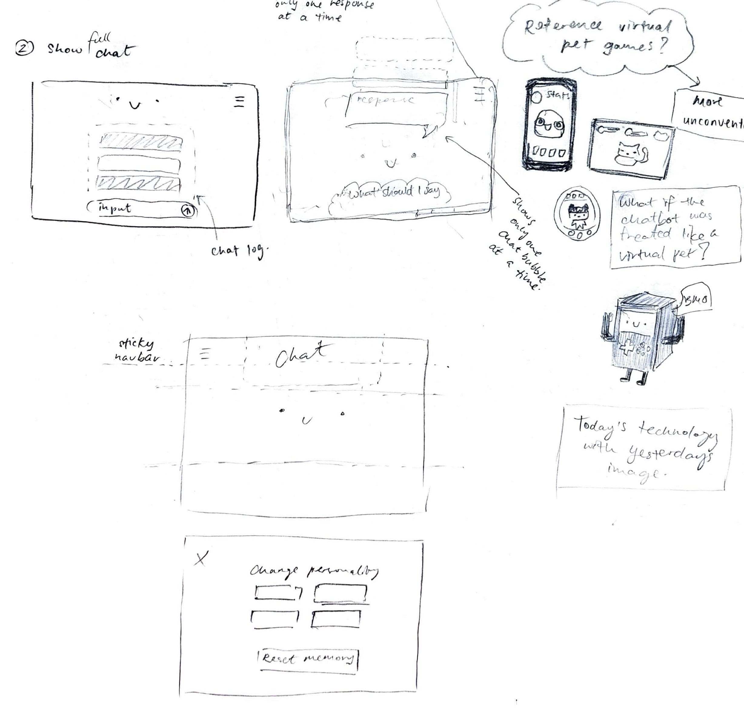
Andreas suggested I could do a paper prototype to help visualise my ideas, so I started sketching a plan for it. The inserts would contain the varied responses and the paired visuals, while the clear file that the paper inserts go into would have the constant items such as the text input bar and the menu icon.
However, I quickly realised that it was somewhat redundant in this case because some of the visuals I imagined staying on the clear sheet would end up changing with the background. In the end it would just be changing the paper in the file, which might not be the best way to prototype this when I could just build it in Figma instead.
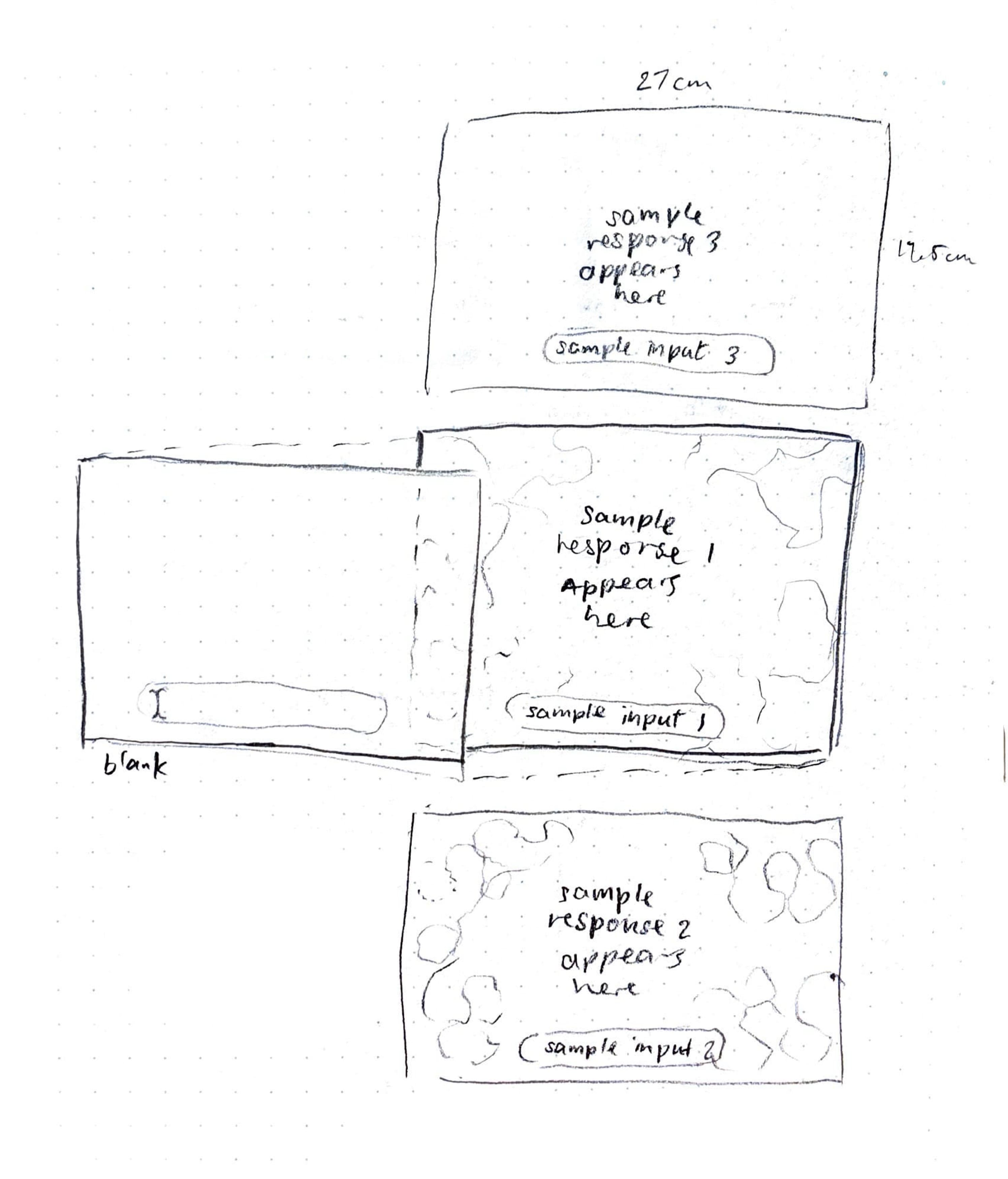
I came away with these 2 samples that use the TouchDesigner visuals, keeping the words as the focus. I think it makes for a pretty clear interface if the focus is only on the emotion visuals, but because I am going to include the different personality types, I will use these as a base for the next iteration.
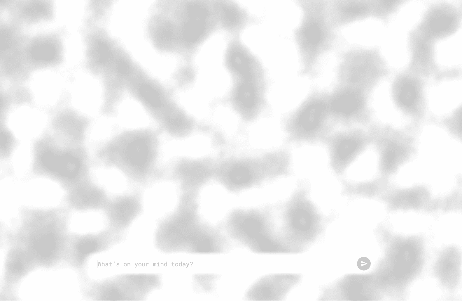
Neutral emotion
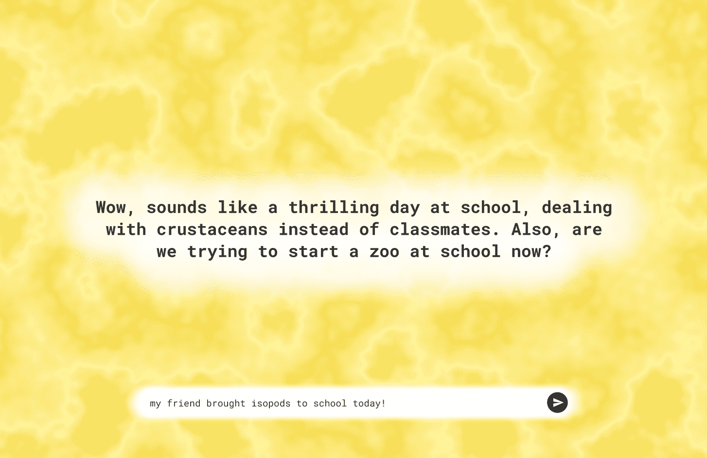
Happy emotion
Adding Face and Personalities
For my second draft, I wanted it to include a face, as I was thinking it could change with the tone of the conversation. This might be a little too ambitious at the moment. As I was looking for references, I realised a lot of existing interfaces are very flat coloured and pretty much all the same.
Here is another round of sketches for the UI, which also includes the menu bar and different personality buttons. While sketching, I thought the placement of the face and elements kind of reminded me of virtual pet games. I am curious if I can apply some of the elements from these games into my chatbot, but right now, since they have such different elements, I will have to consider these later on and focus on what I have now.
Message Visibility and History
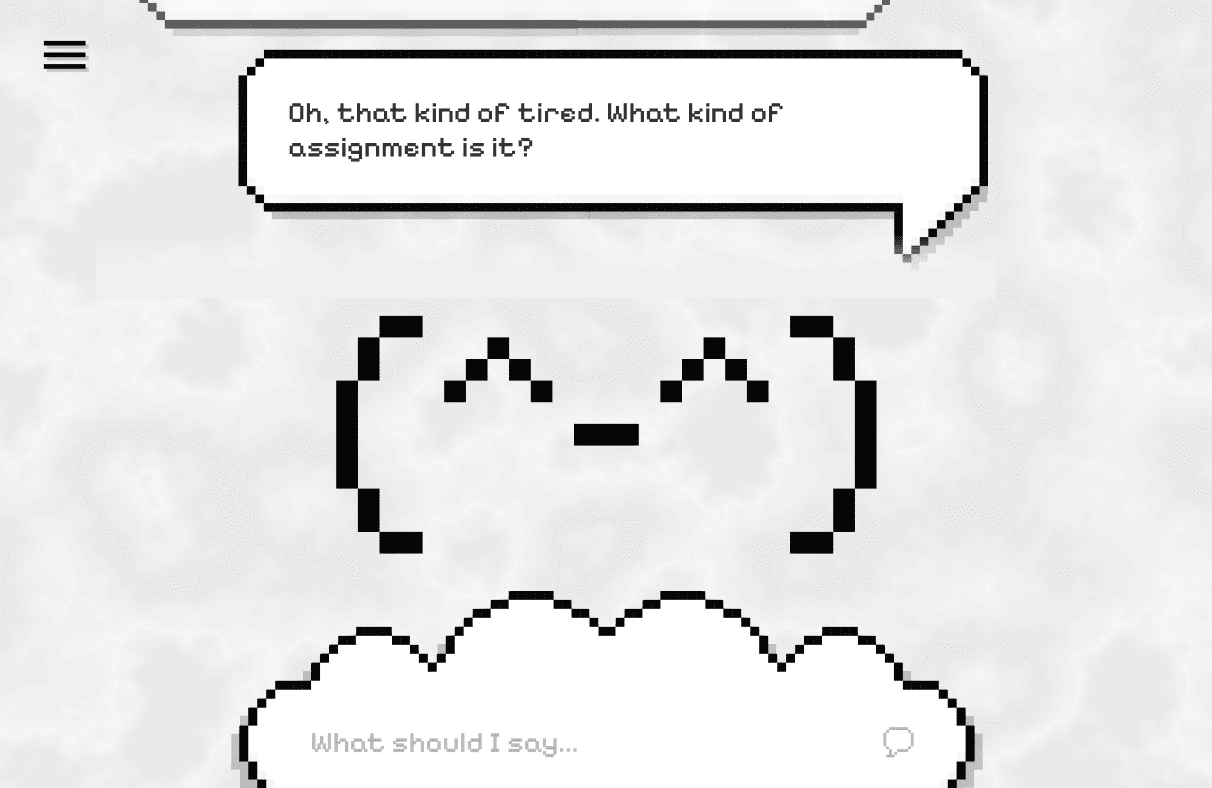
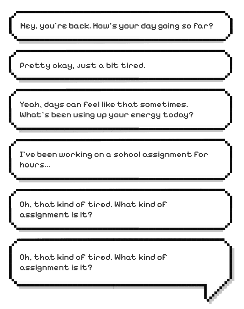
I also wanted it to be designed so you can only see the most recent message as you talk to the chatbot, but I thought it would be a problem if you wanted to recall past messages. For now, I pushed the text replies to the top to hide old messages, but you can still scroll up to see them. I am wondering if it would be better as a separate section where you can look at your history.
Menu Page
For the menu page, I first designed it so that it had the menu items left aligned, where you could toggle which personality to chat with, as well as access the settings.
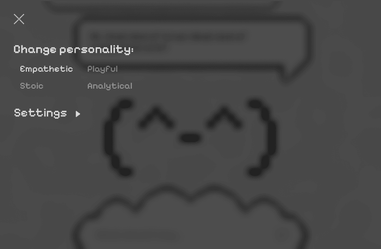
I quickly changed this to remove the settings, because the main purpose of this chatbot is just for testing as a probe. There would not really be any settings to toggle. All I need is to clear the memory in between uses.
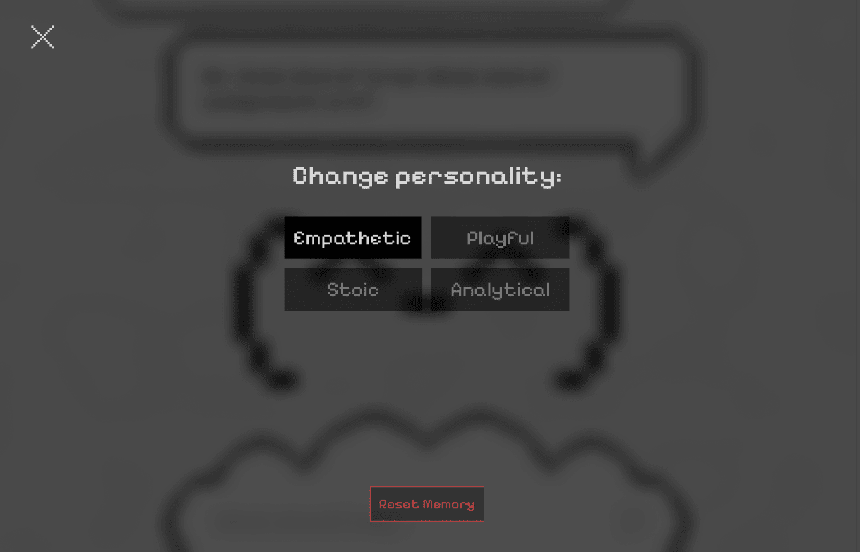
Now I am left with this as a first working draft. I think layout-wise this is alright for now. Even though it is still on the safe side, it is more feasible to carry out realistically. If I can figure out how to build this, then I can work on expanding it or making it more unconventional.