Week 12
This week in class, we went over the final deliverables needed for the semester and did a reflection session where we drew and mapped out a timeline of our studio projects.
In-Class Activity
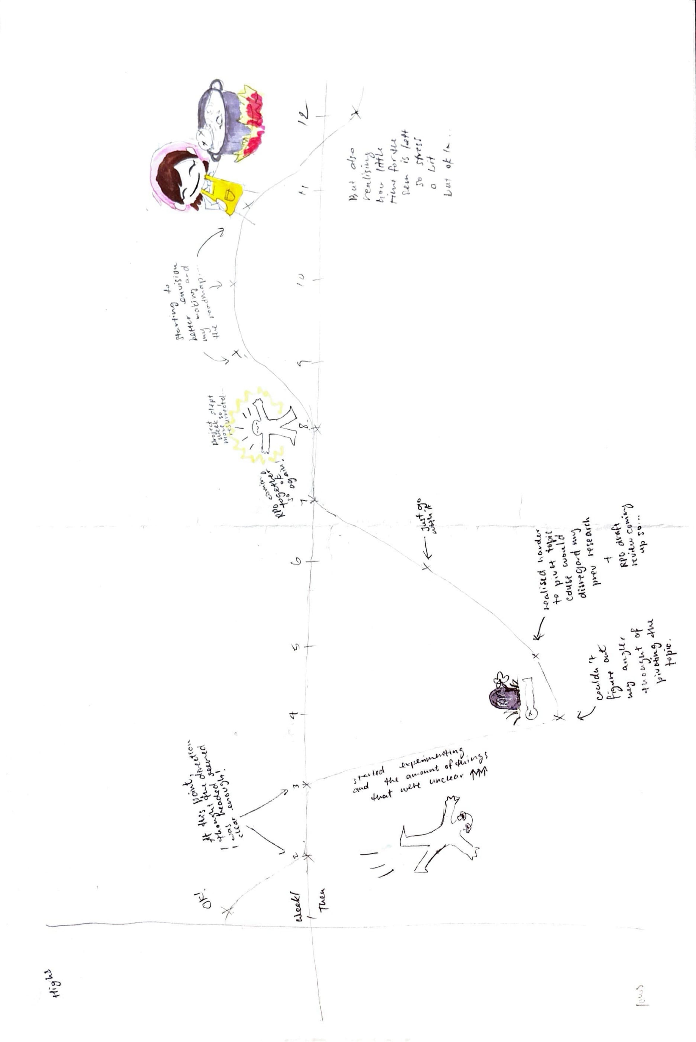
Some low points for me happened pretty early on in the semester because I was having a hard time figuring out and solidifying my direction and aims. I like to figure these things out early as a guide to follow before I start doing things, otherwise it feels like I am just doing things for the sake of it. There’s no aim otherwise, and that makes me feel stuck. But because my low point happened so early on in the semester, it has already been resolved, so this part of the activity didn’t exactly require any more action.
As for the high points, I can’t say I’ve had many so far. There have definitely been small wins here and there, but I wouldn’t consider them highs. I'm definitely aiming for one though! There have just been a lot of worries and details to consider throughout this journey.
Next TouchDesigner Visualiser!
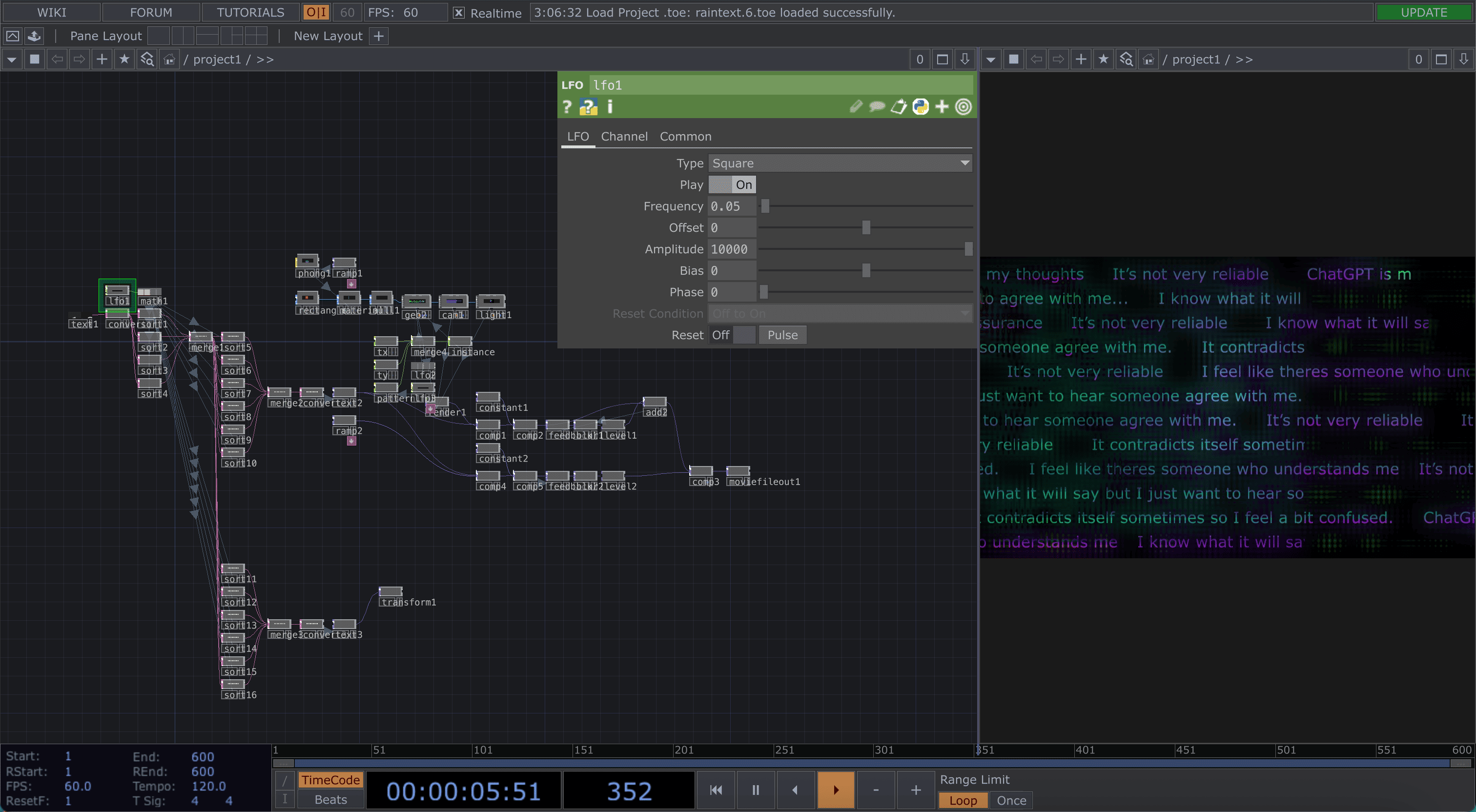
I've already gotten somewhere with my AI emotions visualiser, but I also wanted to target the users. I wanted to visualise their words and feelings after using AI for advice or personal reasons, not just tasks.
After asking around the classroom, I gathered some insights:
“Not for personal advice but I use it for school work. AI contradicts itself sometimes so I feel a bit confused.”
“ChatGPT is meant to agree with me, I know what it will say but I just want to hear someone agree with me.”
“Sometimes I feel like the responses are very enabling… and I don’t like that…”
“It’s good when you need assurance but it’s not very reliable.”
“I feel like there’s someone who understands me, it rationalises my thoughts.”
For this visualiser, I wanted to display these texts and quotes across the screen, maybe as a way to gather responses from anyone who passes by.
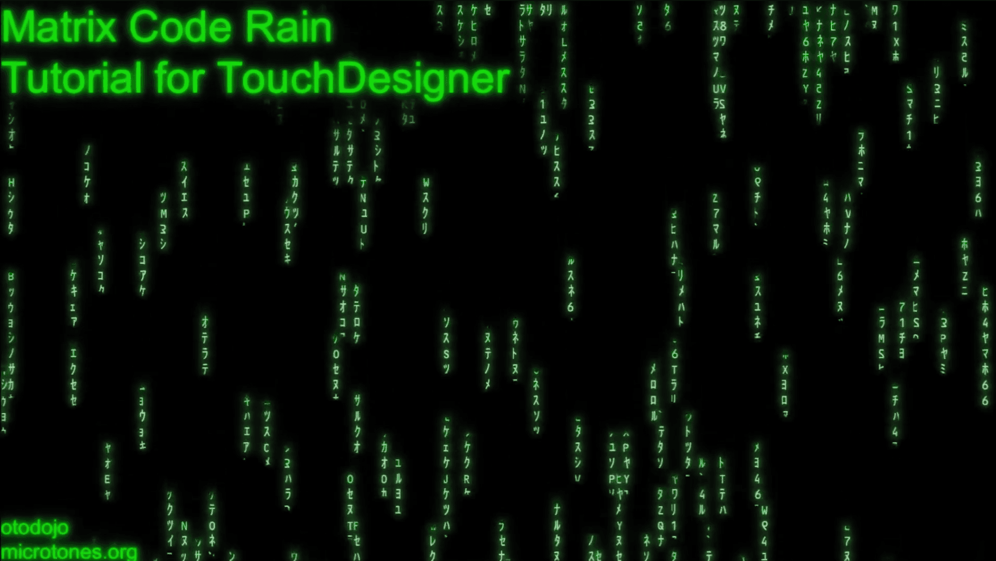
This tutorial is the one I followed for the visualiser.
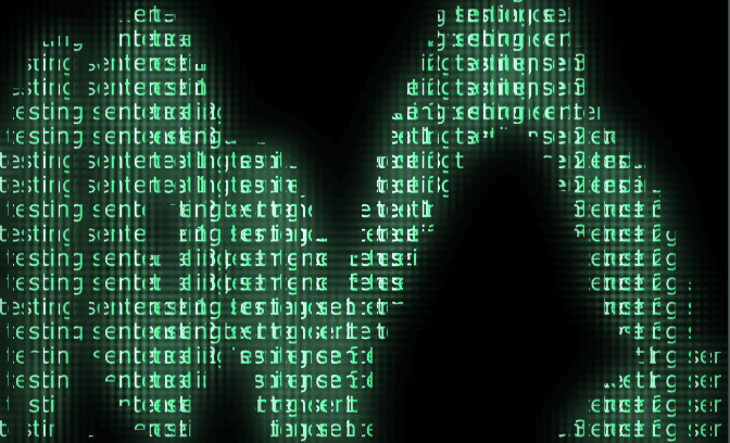
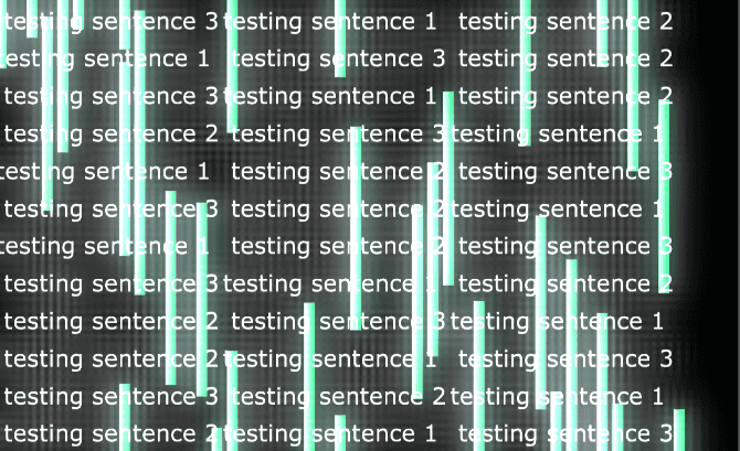
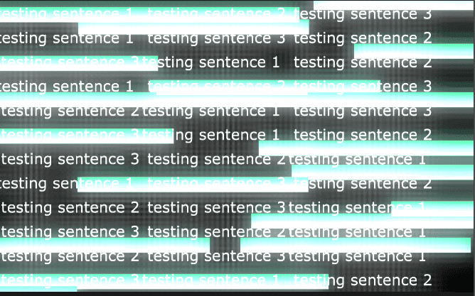
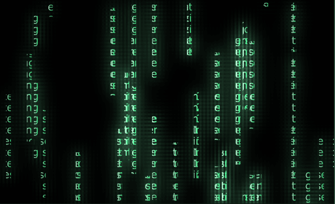
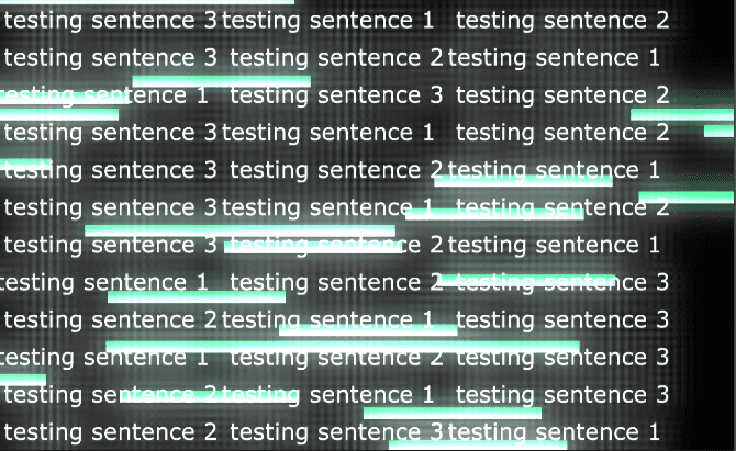
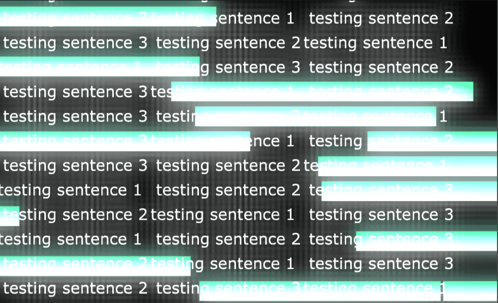
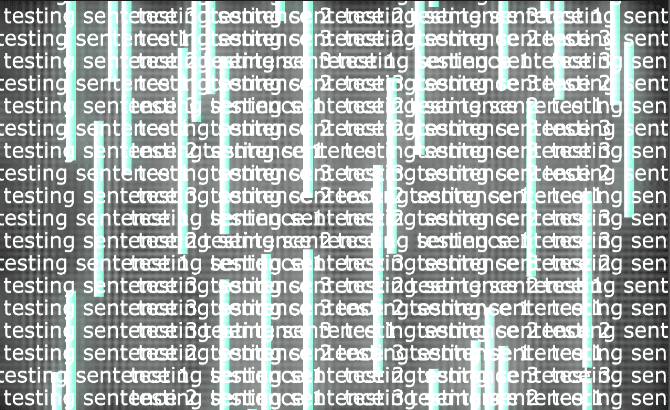
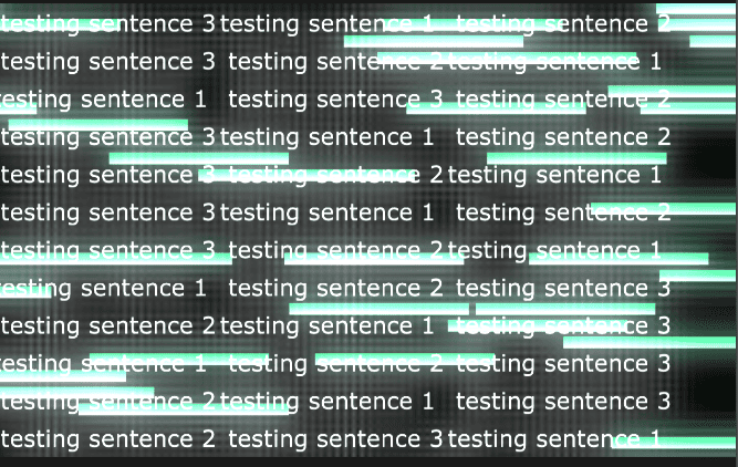
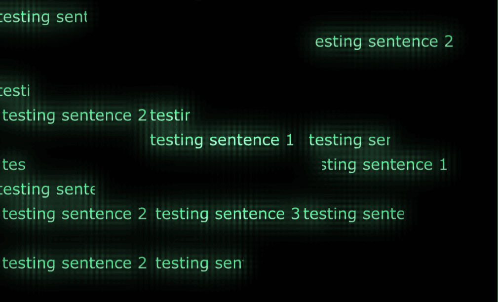
Here you can see the progression I made with my visualiser. I think the hardest part was trying to get all the text to align with the green bars for the effect to take place. Compared to the tutorial, I needed the text to run horizontally instead of vertically.
Something I don’t really like is how flat the background looks compared to the text. Maybe I could try overlapping different text sizes in the background, but I’m worried that the alignment with the moving bars might get messy. Instead, I layered the same text with more blur to give the black background some texture. I also added an accent colour of purple, the complementary colour to green, to give it more visual interest.
I also played around with the pattern of the bars, as it can create interesting wave
patterns and overlapping colours when it’s not fully randomised.