Week 11
Making Week!
This week I explored and researched quite a few things. After my consultation for the poster, I did additional research for references. On top of that, I started building and training my AI chatbot, planned prototypes, and did a quick experiment for an Arduino idea.
Kaomoji Poster Consultation
The first thing that needed to be addressed was the lack of hierarchy in my poster. There is a giant title in the centre surrounded by visuals, and then there is another block of text near the bottom. There’s a lot to look at, so these sections are fighting for attention.
I needed to ask myself what I wanted to achieve through making this poster. Is it for awareness? To call attention? Informational? Once I decide that, it will be easier to determine what takes centre stage.
Andreas also suggested some designers who specialise in typography posters for me to study and take reference from.
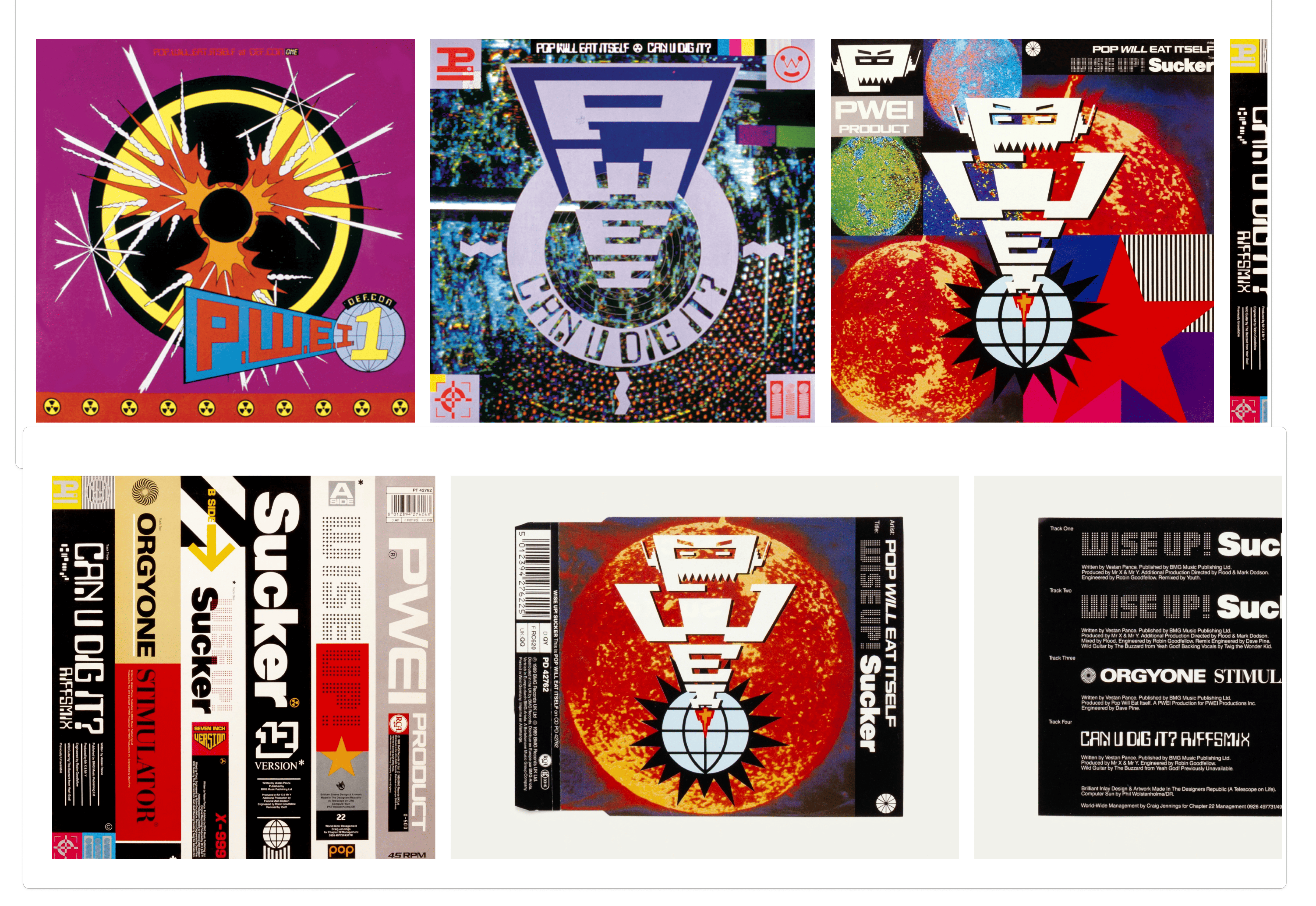
Design Republic
Here I compiled some references from Design Republic, specifically ones with bright colours and strong typographic play. For example, their record covers turn type into a character and use loud visuals in the background. I thought this could be applicable to me since I’m trying to use typed characters to make faces, and these visuals could go well with the TouchDesigner assets I’m creating.
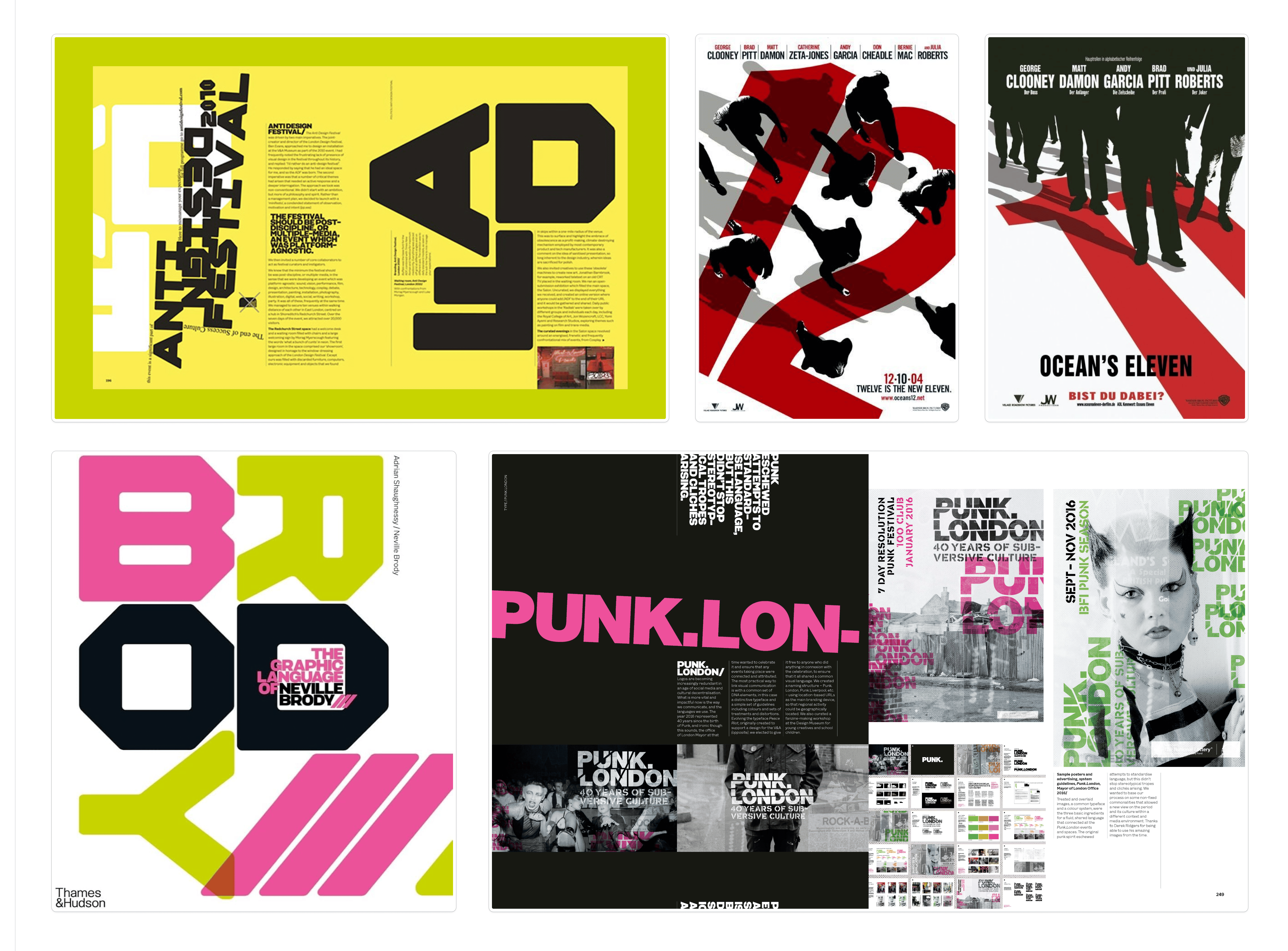
Neville Brody
In Neville Brody’s work, I found fewer references that directly applied to me, but I saved some because I like how he plays with type. There’s a lot of overlapping text and visuals, but he uses only a few colours, so it doesn’t feel too overwhelming.
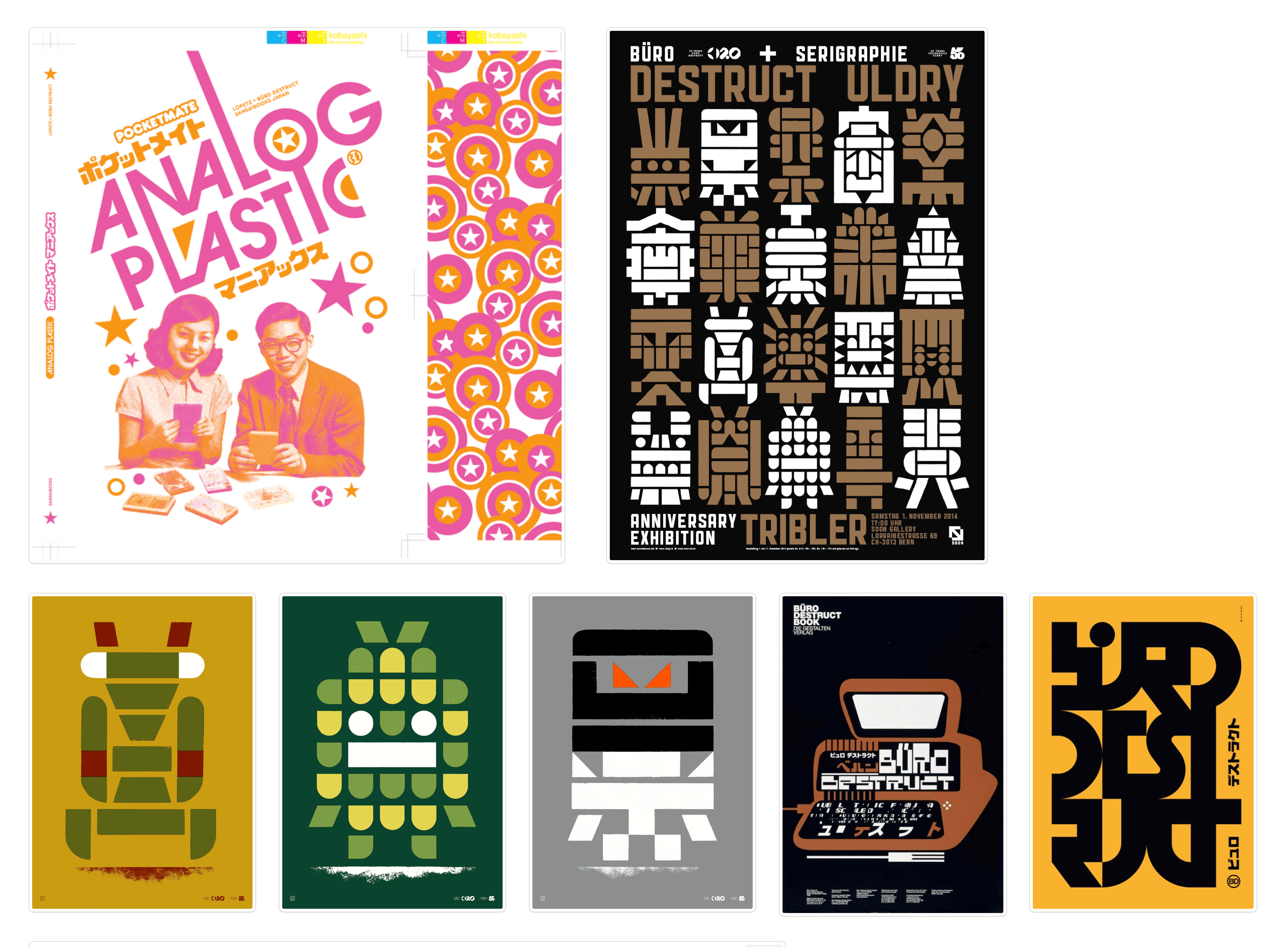
Büro Destruct
The last set of references I looked at was from Büro Destruct. Most of the images I compiled, similar to Design Republic, use type or simple shapes to create characters. This is something I think I could reference as well, especially seeing how their characters were laid out together in larger poster formats.
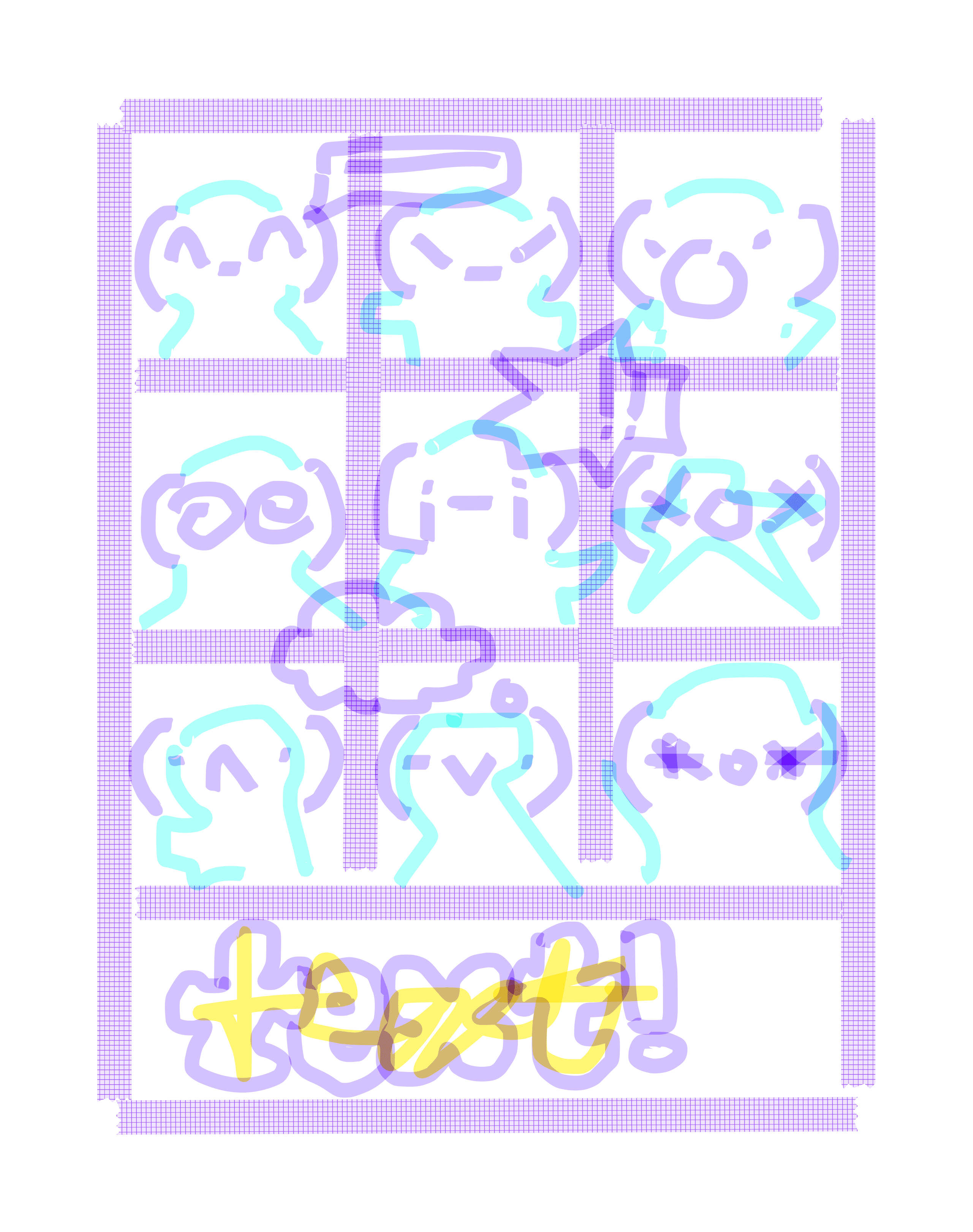
Kaomoji Poster Draft 2
Taking all of these designers into consideration, I did another quick sketch before deciding what the goal of my poster would be. I still wanted the people to be posing in the poster but this time I thought they should be reacting in context to each other, like they are talking to each other from their own window.
What is the purpose???
After thinking about the purpose of the poster, I realised I was kind of deviating at this point. By exploring kaomojis, I thought it would give context to the reason I’m using them as faces in my chatbot. However, I realised there is no other connection or reason for telling people about kaomojis in relation to my topic.
The only reason I wanted to use them was because of their versatility. If people looked at my kaomoji poster now, it would probably be for nothing. They would learn about kaomojis for no real reason. If I wanted to make a poster, it should probably come after the chatbot, so the reason would be to inform people about the chatbot instead.
For that reason, I decided it wasn't contributing to my research as much as the other experiments were, so I put the kaomoji poster on hold (;-;)
Building My Personality Chatbot
For this experiment, I am aware of my coding limitations. While I did my own learning, I also got help from AI to build the backend operations of the website. The main goal here is to learn how to train and prompt the chatbot to get the personality types up and running for user testing.
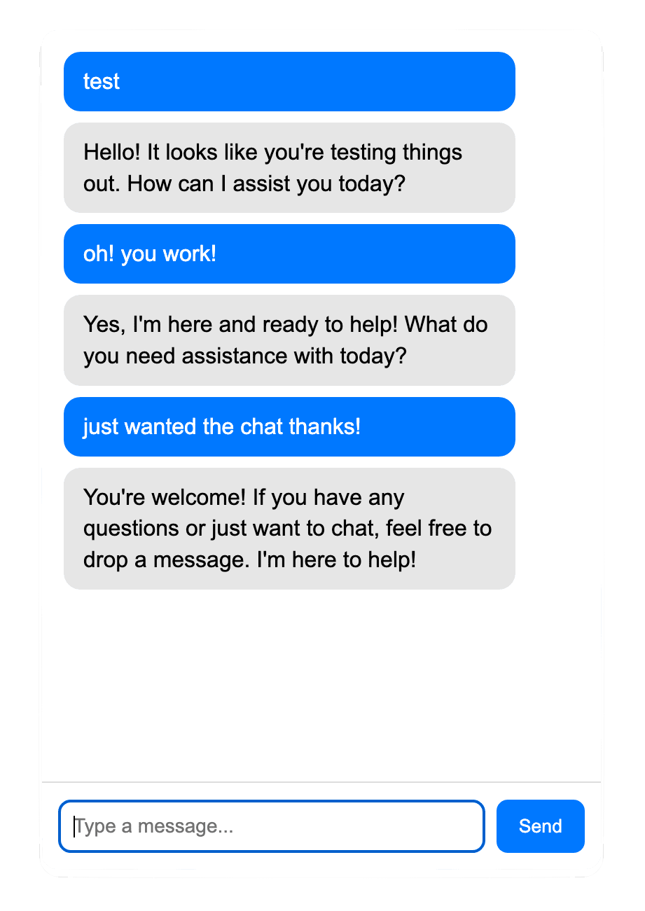
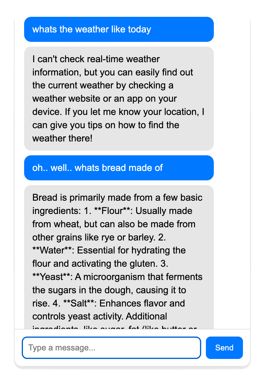
When I first connected my API, I was very surprised to see it work, especially since my TouchDesigner project that also used an AI API did not work as easily! From the responses in the pictures, we can see that it's just a basic AI with a neutral and robotic tone.
I then managed to make four separate personalities, each with their own primer instructions:
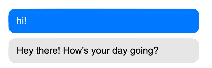
Empathetic personality
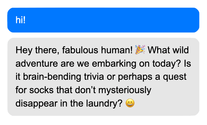
Playful personality
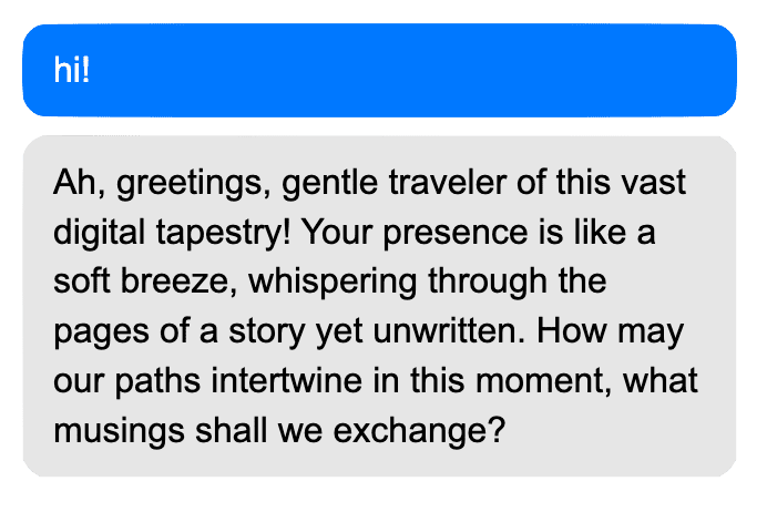
Dreamer personality
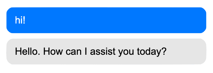
Stoic personality
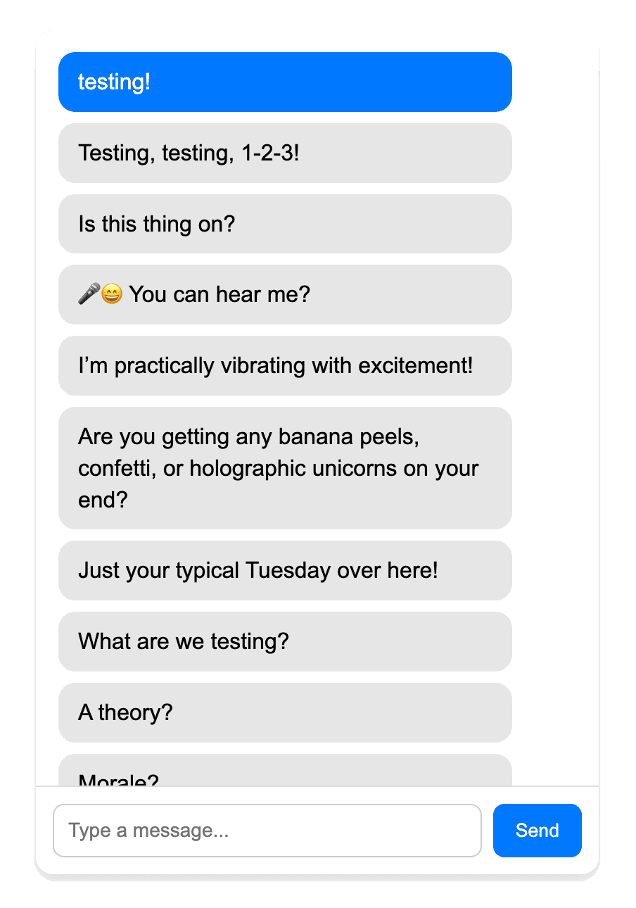
Something I didn’t like was how all the text was grouped together. It felt very
unnatural for a conversation, so I found a way to split the text into bubbles instead.
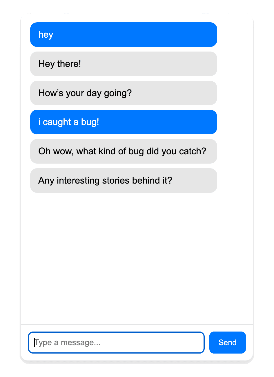
The next problem to tackle was making the primer instructions more specific. Though it’s
an easier fix, the chatbot’s voice still feels very forced. While the text bubbles now
split, the tone is still unnatural. That is something I will be working on when refining
my primer messages.
Arduino Ideation
Something I wanted to experiment with was using other modes of communication with AI rather than the typical texting interface. The first way I envisioned this was through touch. I had a rough idea I wanted to test out.
I wondered what would happen if I touched different parts of a physical AI doll, and that touch translated into either sound or visuals on a screen.
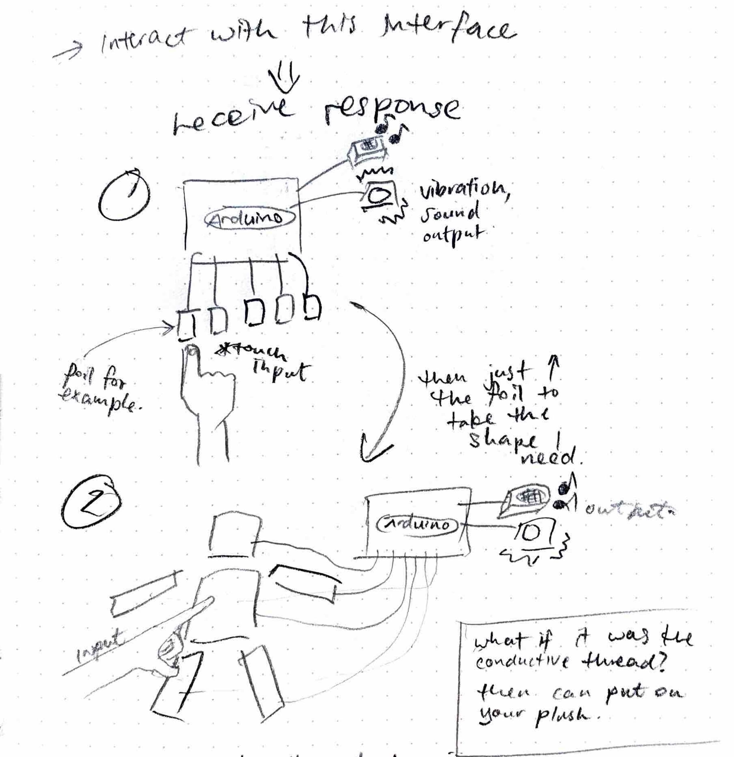
So I decided to try making a capacitive touch sensor using an Arduino. It’s a rather simple experiment, but I think it could be applied later on, possibly in the sketch I made, where going over a certain capacity threshold could signify pain for example, as if you are pressing it too hard.