Week 10
This week’s focus was on the kaomojis explored in the moodboard from Week 8, as well as looking into perceived personalities and examining what AI’s notion of personalities are.
Discussion with ChatGPT
I did a quick exercise by having a discussion with AI about perceived personalities.
Click here to read the full chat.
As I mentioned before, I feel that personalities are something very human. This
exercise explored how something that does not feel the way we do envisions what
different kinds of personalities are like. Through this, I was thinking of using its
responses to explore the kinds of personalities I could train my chatbot with.
Because AI is aware that it doesn’t experience liking or disliking personalities, it
looks at personalities from a very analytical standpoint, deciphering what is more
or less favourable in conversations.
“To answer your question about which kinds are more favourable or dislikable
— I
don’t experience liking or disliking, but I can recognise which
personalities
tend to foster meaningful or engaging exchanges:
* Curious personalities — they invite exploration, they ask “why?” and
“how?”
and leave room for reflection.
* Authentic ones — people who don’t overperform a role but speak naturally.
They
make interactions feel human, not performative.
* Empathetic ones — not just kind, but attentive to nuance. They don’t rush
to
react; they listen.
On the other end, the less “favourable” personalities (in conversational
design
terms) tend to be:
* Performatively detached — like when people try so hard to seem unbothered
that
nothing real emerges.
* Overly rigid — when someone sticks too tightly to an image they’ve built,
even
when the situation changes.“
It even provided a sort of “reflection” about its own personality:
“As for my own “personality,” it’s designed as a balance between attentiveness and adaptability — a mirror that shifts tone based on how you speak to me. But if I had to prefer something, I’d lean toward personalities that are self-aware”
Kaomoji Poster
Next up for this week was to design my kaomoji poster. I decided to go through with this
poster as a contextual piece for my chatbot, since I wanted to use kaomojis as its face.
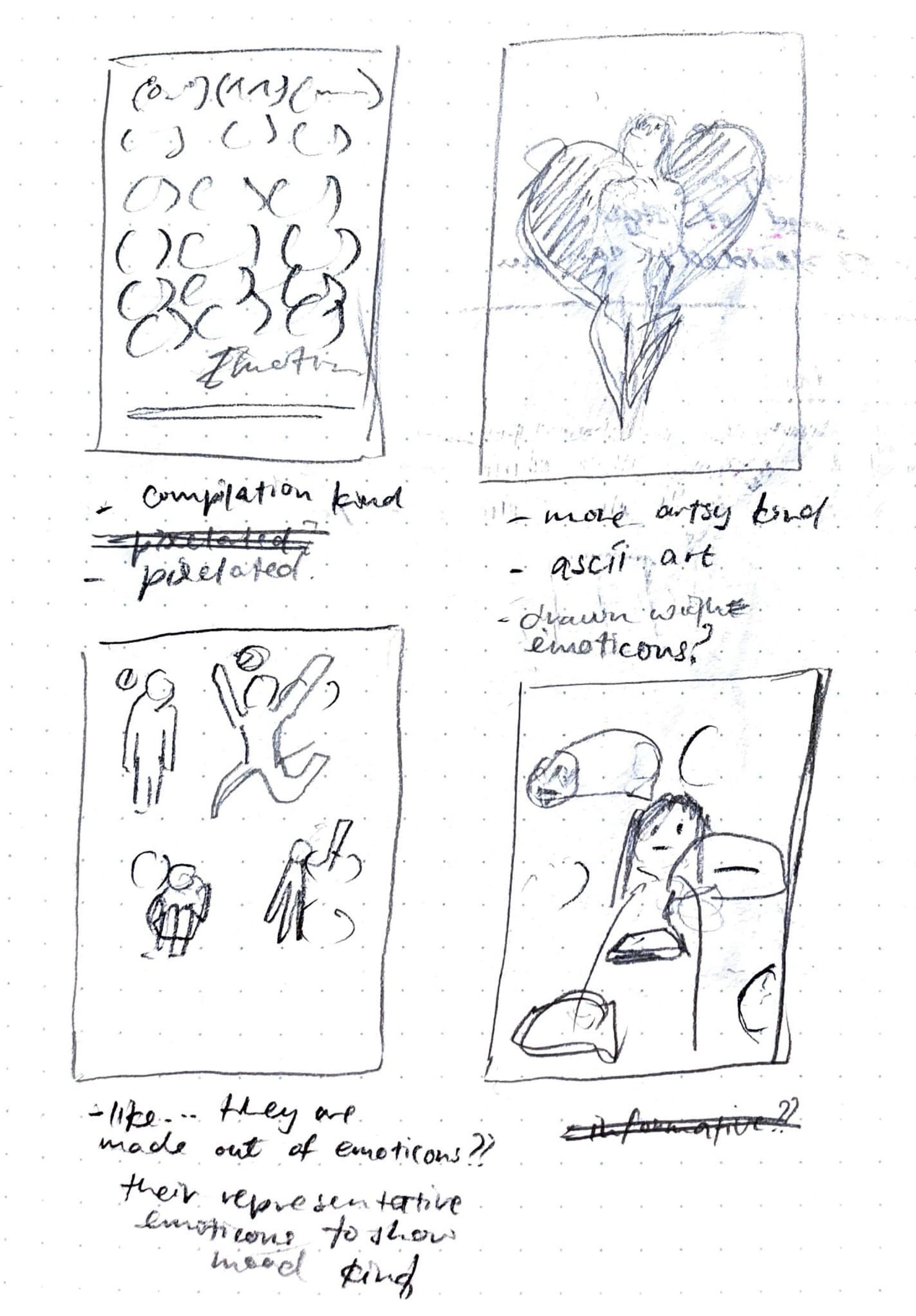
I started off with some sketches of possible layouts to communicate different things. I
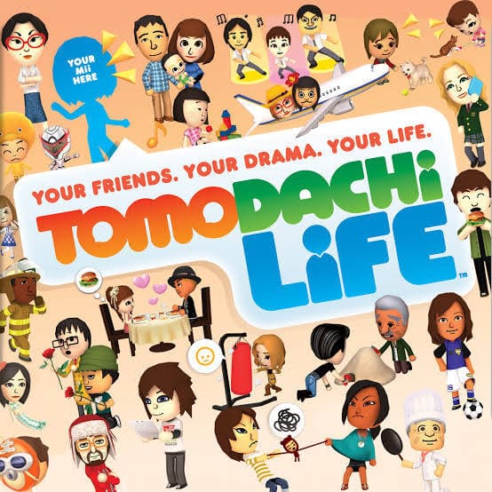
was kind of inspired by the cover of a Nintendo game, Tomodachi Life, which
features multiple characters doing different expressions and actions.
Rough Layout
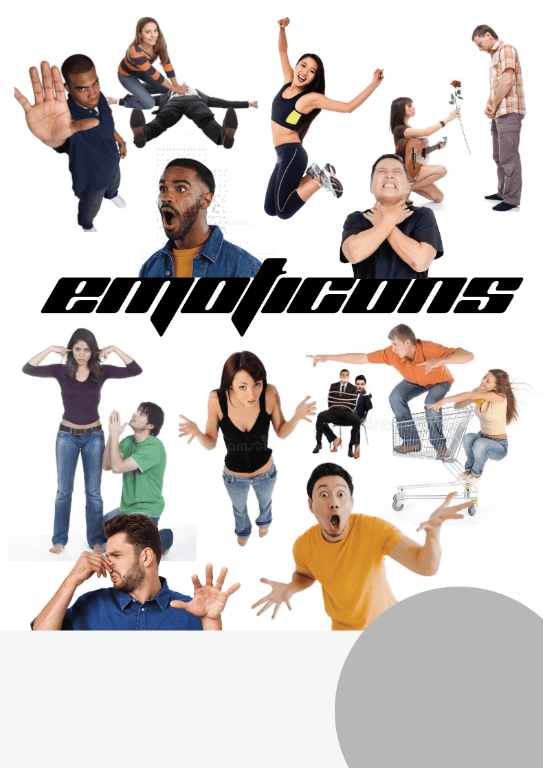
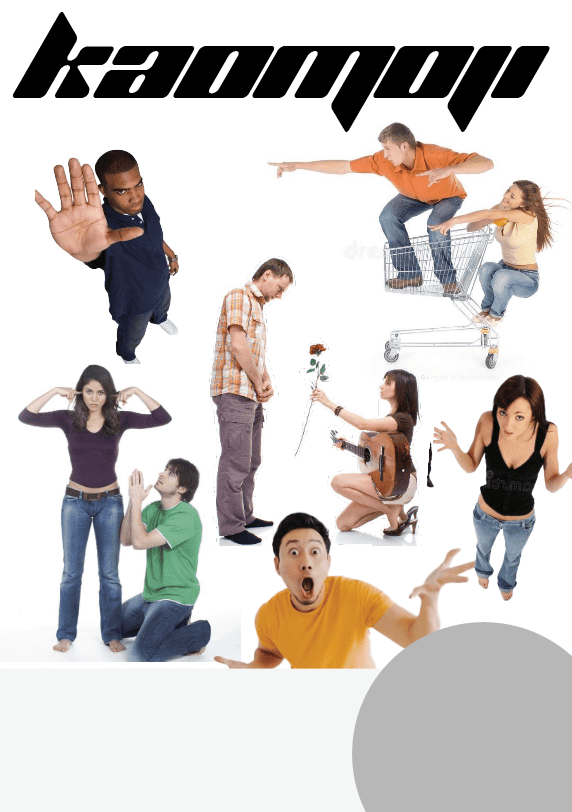
I decided to go in the direction of filling the page with multiple kaomojis, but I didn’t want a standard side-by-side layout. I thought it would be better to scatter them throughout the page. To exaggerate the expressions used in the kaomojis, I thought there should be people in the background to represent the face being made. So I started laying out multiple exaggerated poses that would later be overlaid with kaomojis.
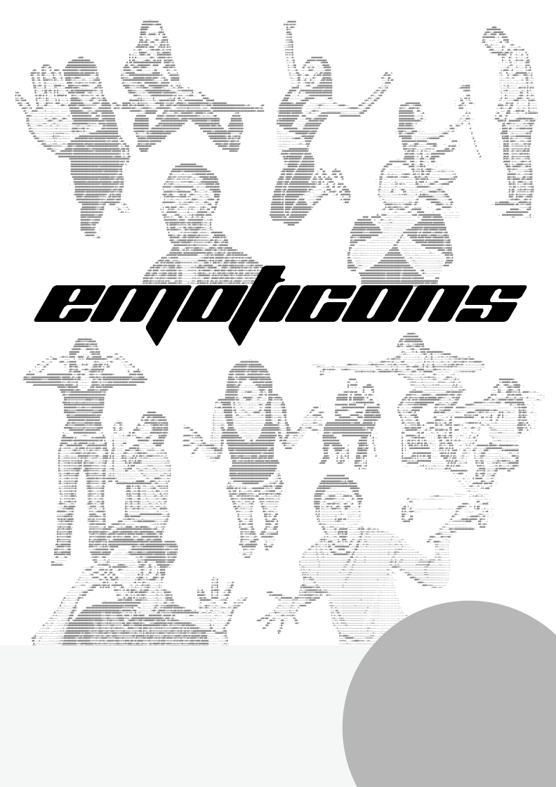
With the rise of kaomojis came ASCII art, so I decided to commit to that aesthetic and filter the pictures with that style. Since kaomojis gained most of their popularity in the 90s, I went with a more retro look and font.
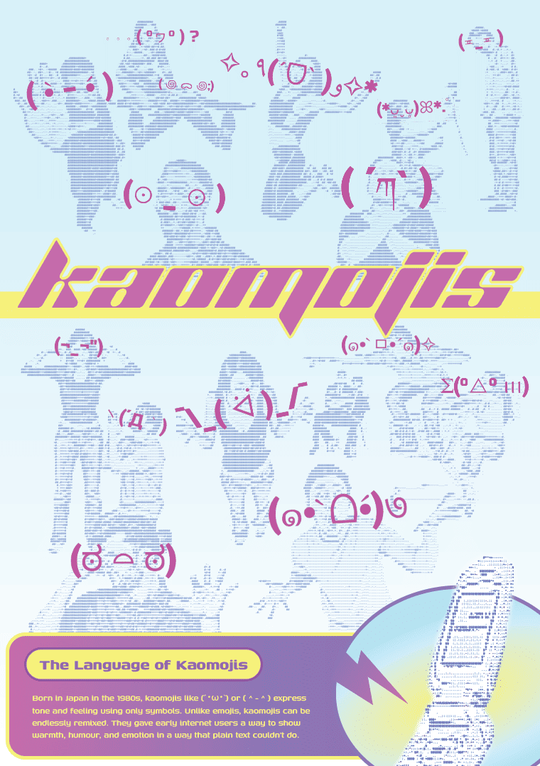
After that, I found suitable kaomojis for each pose and added extra text at the bottom to give more context on what they represented.
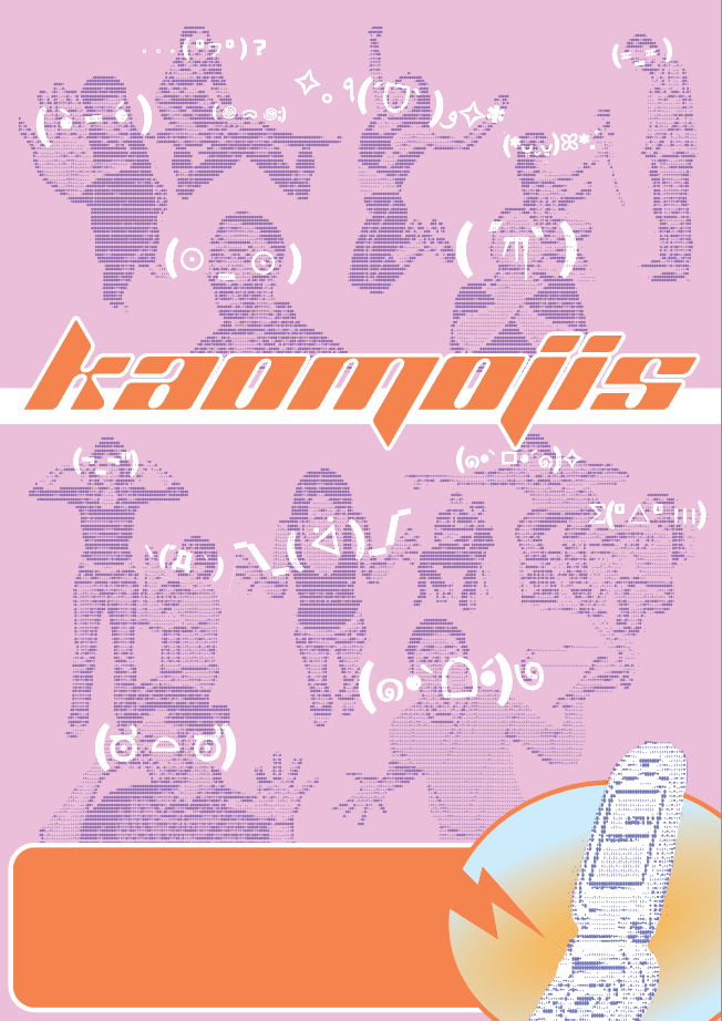
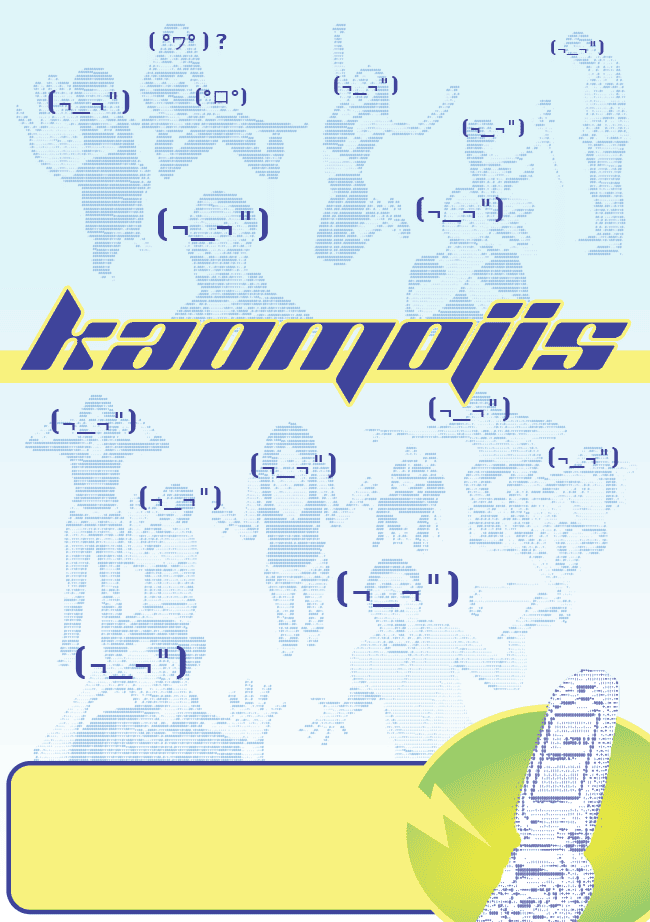
I also tried out two other colour schemes, but I felt that they weren’t as good as the first one.
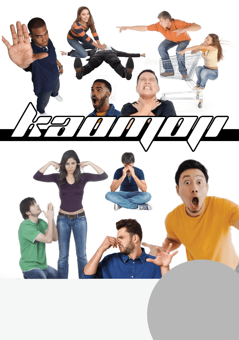
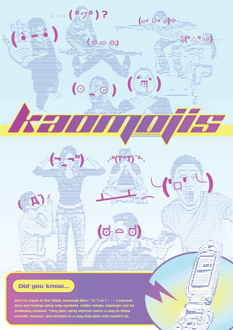
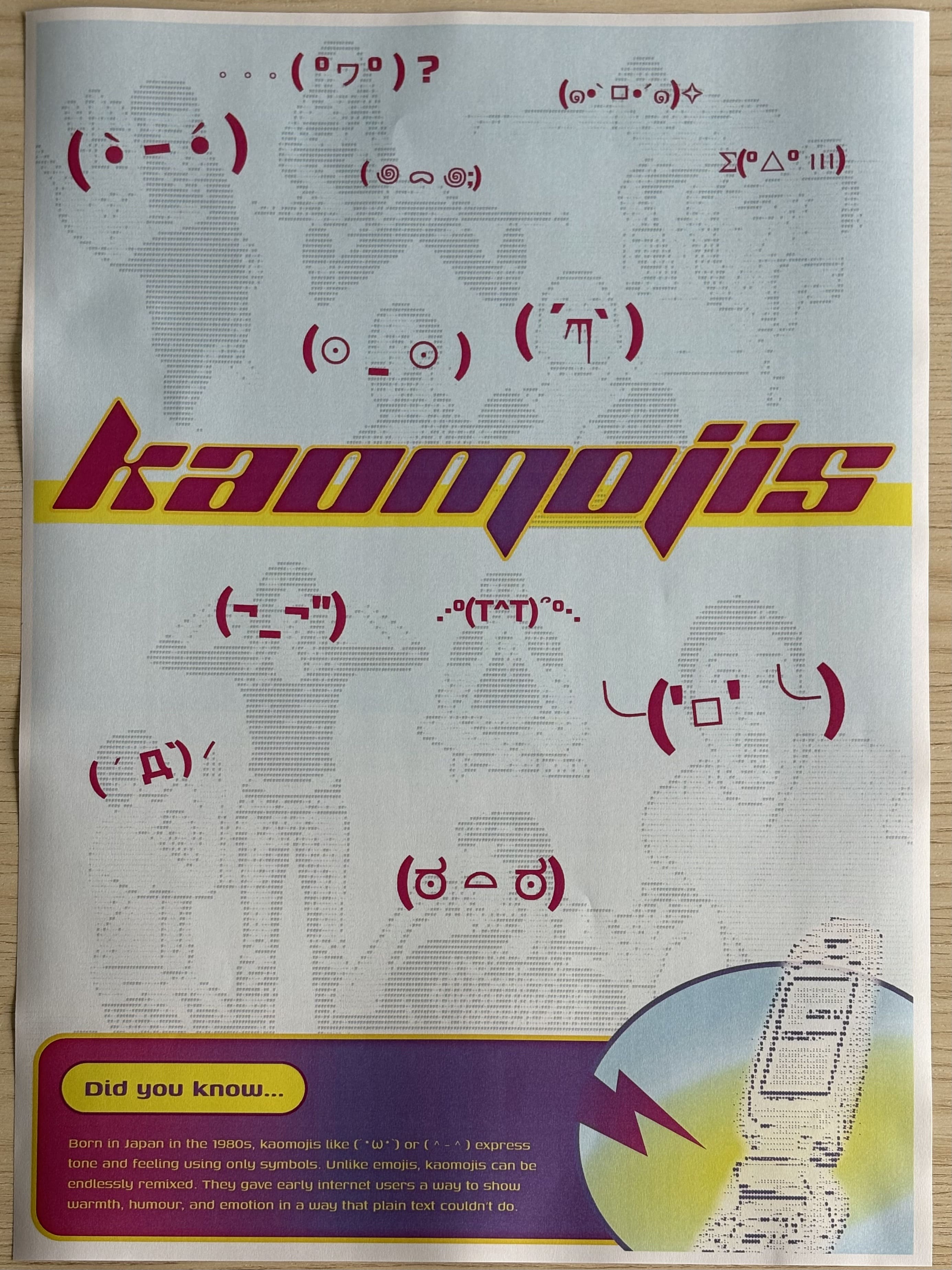
After completing this first set of drafts, I realised the kaomojis appeared a bit too
small when they should have had more focus. So I rearranged the poses, removing some so
others could have more spotlight.
I also did a test print to see if the font sizing was alright. Poster making is
definitely not my forte, but it was a good practice for me to pick back up. I think this
first round of drafts is still kind of messy, so that is something I will improve on
next round.